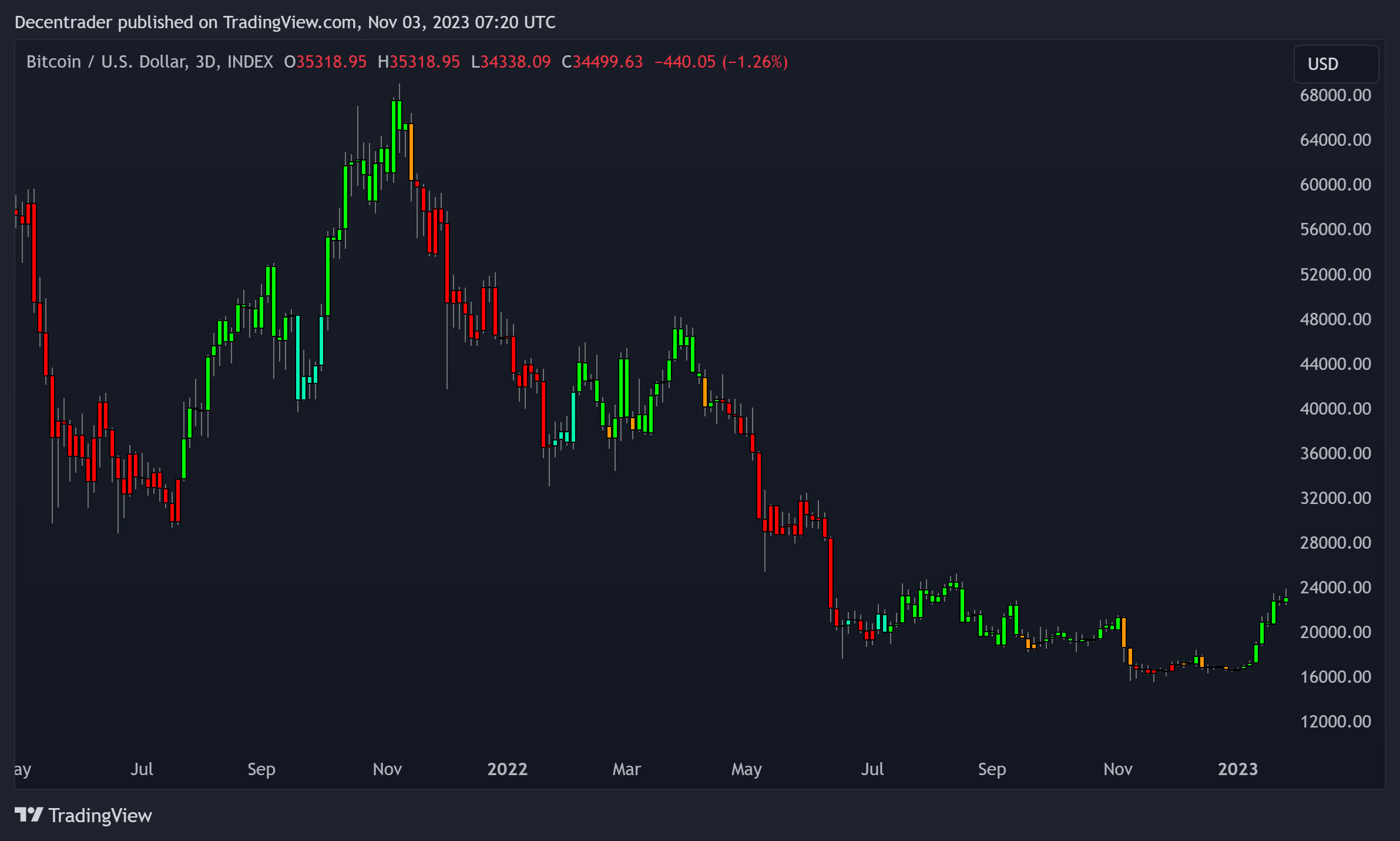
btcusd Liquidity Map
Liquidity Maps are extremely useful for visualizing liquidation areas on a tradable asset. They can be used by market participants to
- optimize stop-loss positioning - avoid where the crowd has set their stops!
- set profit targets for breakout trades - take profit at or before areas of liquidations.
- use areas of large liquidity to enter positions of size to avoid unnecessary slippage.
The Liquidity Maps show where there is likely liquidation risk sitting. These pools of liquidity are where financially large players in the market (often referred to as whales) can look to enter or exit positions so that they avoid slippage.
It is not unusual to see very quick price action in these highly liquid areas, resulting in the potential for significant losses for any traders who are not aware of them. Therefore, being able to visualize long and short liquidation levels on an asset is highly valuable.
The areas with the tallest liquidity lines on the chart are price levels with significant liquidity. The market price will often trend towards these areas.
It is important to note that each bar does not represent an exact number of liquidations, but is a count relative to the other liquidation levels. Therefore it shows how likely it is that the market will be affected by the liquidations and liquidity there.
Once large players (whales) have filled their positions in areas of sufficient liquidity, they can try to push market price in the opposite direction. This is one reason why areas of liquidity on the chart can often mark a local top or bottom in price.


 Subscribe
 Accept Cookies?